Tag Archives: Cover Art

Shelf Candy – Interview with MARC GASCOIGNE, Managing Editor & Art Director, ANGRY ROBOT BOOKS

21 Apr
Shelf Candy is a weekly meme hosted by the lovely Five Alarm Books.  This meme gives us an opportunity to highlight a cover we love and the artist who created it.  Please click the button above to find out how to participate and to see what other covers are being discussed this week.
***
This week I decided to do something different.  Rather than focus on one cover and one artist, I wanted to take a look again at the other half of the cover design team – the Art Director.  The AD is often responsible for the overall concept and for selecting and commissioning an artist to take that concept and turn it into a cover.  I approached Marc Gascoigne for an interview.  He is the founder and managing director of Angry Robot Books, a U.K. based publisher whose mission is to “publish the best in brand new genre fiction – SF, F, and WTF?!”  Yes, I love that mission, too.  Art Director is just one of the many hats Marc wears at Angry Robot and he was kind enough to take time out from a busy week of London Book Fair craziness to answer some questions on the origins of Angry Robot, his process, and his favorite curse word.
WHY I LOVE ANGRY ROBOT COVERS
They are unique and bold.  This is the primary reason I am drawn to the company’s covers across the board.  I tend to like the ones with a retro/vintage look but I also appreciate the strong graphical approach they take to design.  Edgy and young, the Angry Robot aesthetic is fast becoming one of my favorites in cover art.  Perhaps the one I’ve been gushing about the most this week is the cover for Chuck Wendig’s Blackbirds.  I know this is not an original choice (take a look at the Qwillery‘s Debut Author Challenge Cover Wars where this design is winning by a landslide – vote people!), but the cover is too beautiful not to mention.  A She-Wolf review of the book will be posted soon.
Please welcome Marc Gascoigne!
SWR:  Can you tell us how and when Angry Robot was established?

I set up AR under the aegis of HarperCollins in late 2008. A couple of the more forward-thinking folks there had seen the work I’d done at Black Library, supporting that book imprint by building a community of dedicated readers and fans, establishing a strong brand identity, and starting to embrace the changes in publishing that online and digital developments were promising.

Alas, self-same folks moved on from HC just as we launched, and as is so often the way, those who remained didn’t quite get what we were about. The end result was that nine months later we moved to Osprey Group. Although on the surface it was an unusual new home – military and historical non-fiction – once one considers the customers’ profile it becomes obvious. SF also has fanatical, enthusiastic, hobbyist readers, who are *into* the subject, who follow online and printed reviews, who have “Wants Lists” of titles they’re after. The amazing team at Osprey helped us get back on our feet within a few months, and we also launched in the USA at last. Since then we’ve just grown and grown, as indeed have the other parts of the group.


SWR:  You wear a few different hats at Angry Robot.  Can you tell us a bit about what you do in your role as Art Director for the company?

Quite simply, I commission the covers, usually to concepts that I have come up with. That involves a bunch of tasks: research the market, gather some concepts for the cover, research elements, track down a suitable and available artist, and supervise the process of to-and-fro as we work up the illustration and/or design. Sometimes I work up the typography – book titling, author name, and so on – too. On a few occasions, I’ve designed and illustrated the cover too, but not too often.


SWR:  What is the Angry Robot brand?

Erm, it’s a little robot with a red eye-slit. His name is Angstrom. You must have seen him.


Resistance is futile.


SWR:  One thing I love about many of the Angry Robot covers is the retro feel they have (Dead Harvest and Evil Dark).  There is an edginess to a lot of the designs.  Is there a certain look that is quintessential Angry Robot or that illustrates the Angry Robot brand?

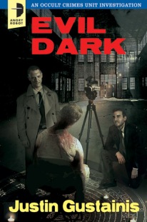
No, but certain themes do recur, of course. And I’m not sure that “many” is quite right – really just two series, out of thirty or more. The Justin Gustainis books – police procedurals set in a town where vampires and werewolves are the norm – seemed to demand crime packaging to reinforce that side of the content, while the illustration had supernatural and occult elements. It was a short step from there to grab some old US pulps of the 50s and 60s and riff on their design.


The Chris F Holm titles took things a little further, and I must confess it is the only cover design I’ve commissioned that I deliberately didn’t show anyone, in case someone talked me out of it 🙂 It came from the recent online meme where designers recreated classic rock albums and Harry Potter books and movies in the style of old Penguin paperbacks. The Sam Thornton novels explicitly reference classic Dashiell Hammett and Raymond Chandler novels, and while looking at different designs of those I kept coming across the same Penguin designs. It was obvious to me that was the direction to go. Unbelievably, everyone agreed with me, and we’ve probably had more acclaim from fellow publishing types for those covers than any others.

As for the AR style, well, everyone very kindly focuses on the best covers rather than the ones that were more everyday, or didn’t quite work. But I have my favourite approaches, and certainly my favoured illustrators (as a quick glance at the five Joey HiFi covers across three authors will instantly reveal). To some extent, perhaps Joey’s covers stand out most, but overall I’d perhaps venture it’s just that we use more graphical approaches than most, and we’re not afraid to try something a little different.


SWR:  What is your creative process when designing a book cover?

It depends. Some, well, I have the idea gathering shape even as the book goes through the acquisition process (editor likes book, gathers potential sales estimates to convince sales team we should buy it, does so). Others come from suggestions by the author or the book’s editor. Questions are asked: who’s the readership, how old are they, what’s the genre of the book, what is working in that area, is our chosen illustrator available and what are their limitations, is the book a larger trade paperback or a smaller mass-market. And always – does the design work as a small on-screen thumbnail as well as a physical book?


SWR:  What makes a good book cover?

The purpose of a book cover is to sell a book, and the best do that – mostly by creating an accurate but also alluring impression of the thrills the book will offer. Then again, some are deliberately quirky, to get you to pick them up, and then hope that the design doesn’t let down or misrepresent the contents. The best and worst thing is that everyone has a different favourite cover (almost), from experimental graphics to florid romantic or fantasy paintings. But I always try to remember – if everyone’s wearing black, the guy in the white suit will always stand out.


SWR:  What have been some of your favorite Angry Robot covers and why?

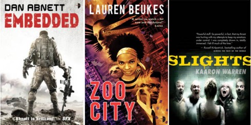
Embedded, because Larry Rostant nailed exactly what was in my head, that I’d seen when I read Dan’s novel. Zoo City by Joey HiFi, because it was something so immediately different yet recognisable. Slights, because even though I know some of the people on the cover and they’re all lovely, normal people, Stef Kopinski’s photo still scares the hell out of me. The World House, cos I designed it and people liked it. vN because Matt spent days and days building all those robot parts on the computer, only to dump Amy into them. The Great Game because David Frankland’s artwork is so simple yet so clever. Seven Wonders (which we’ll show the world next week) because my god, Will Staehle is a genius modern cover designer.


And for fun, Marc was game enough to take the Pivot quiz.  Here are his answers:


What is your favorite word?

Tsujigiri.

What is your least favorite word?

I don’t have one.

What turns you on creatively, spiritually or emotionally?

Thinkers, thinking, rethinking.

What turns you off?

An unexamined life.

What is your favorite curse word?

It changes from day to day.

What sound or noise do you love?

Cat purrs, depthcharge deep bass, my daughter’s gentle snoring, the sound of an enormous door slamming in the depths of hell.

What sound or noise do you hate?

The alarm clock.

What profession other than your own would you like to attempt?

‘Attempt”? Life isn’t a rehearsal, kid 🙂

What profession would you not like to do?

I know someone who runs a sock factory. He wears grey clothes. That.

If Heaven exists, what would you like to hear God say when you arrive at the Pearly Gates?

Unlikely on so many levels, but thanks for asking.


***

Please stop by and visit Marc at

TWITTER |  WEBSITE 

& of course visit Angry Robot and take a look at some of the covers/titles in the their current line-up

ANGRY ROBOT

Tell me which cover is your favorite!

Now, let’s get to reading…


Shelf Candy – Aly Fell and Discount Armageddon

14 Apr

Shelf Candy is a weekly meme hosted by the lovely Five Alarm Books.  This meme gives us an opportunity to highlight a cover we love and the artist who created it.  Please click the button above to find out how to participate and to see what other covers are being discussed this week.

***

WHY I LOVE THIS COVER

This is another cover that really stands out on store shelves.  I love its retro/pin-up feel and the choice of color.  The use of pink in the text and on Verity Price’s clothes are a nice contrast with the dark background.  There is a sense of humor in the cover that I appreciate – a mix of light and dark that I think fits with the story.
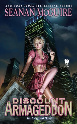
 

The cover was designed by the UK-based illustrator/artist Alistair (Aly) Fell.  I bombarded Aly with a lot of questions and I considered cutting some out for this final post but I couldn’t bring myself to do it. I loved his answers and I am excited to share this with you.  Special thanks to Aly for his patience with my interrogation!

Please welcome, Aly Fell!


SWR:  Can you tell me a little about your art background and how you got started in cover illustration?  What was the moment of no return in which you knew this is what you wanted to do professionally?

I don’t know how true it is for other ‘artists’, but to me there wasn’t really any doubt I’d end up doing something with art from the day I first picked up a pencil. Either that or a career making spaceships or trains out of Legos! My parents would say to my sister and me: “draw us something”, rather than plonk us in front of the television, and I’m forever grateful to them for that. I nearly always ended up drawing women; Joan of Arc was a favourite of mine along with Lady Jane Grey for some reason. I don’t know what psychologists would make of that, an obsession with the tragic female ideal maybe, (let’s face it, the Pre-Raphaelites made a career out of it!), but it’s a theme that grew into an attempt to present women as human beings in ‘situations’ rather than as objects or simply muses. I mean, I love pin-up art, Gil Elvgren is a favourite of mine, but something I’m always aware of with pin-up is ‘the male gaze’. I attempt to draw women for not just men, but to give them an independence from that default. Not exclusively, and at times it doesn’t always work either, but that’s my aim.

My art training was pretty standard, from a UK perspective: A level art, a foundation course, then a diploma in graphic design. I was turned down by Corsham College in Bath, where I was given a grueling interview, because I drew women and silly animals! (Too much reading of Heavy Metal Magazine I expect).  All throughout my education I was told I’d never get anywhere doing what I did at the time. Despite getting a fair basic education, it was up to me to find what I wanted to do in my spare time, and just stick with it.

Danger Mouse - animated TV series

Almost by accident I ended up at Cosgrove Hall Films in Manchester working in animation as an “inbetweener.”  I ended up animating on shows and features, ‘Dangermouse’, ‘Count Duckula’ etc, and in 2000, as animation was definitely going through a slump, I moved into games. It was about then my wife got very ill and I decided it was time to rethink where I was going, and where my priorities lay. So I quit the job, crossed my fingers and decided to go freelance. ‘Covers’ have come along as part of that, and have been wonderful!


SWR:  Tell me the story of how you got involved with the Discount Armageddon project?

I was approached by Sheila Gilbert at DAW books via email. Apparently Seanan McGuire had seen my work online somewhere, and it was rather lovely to learn she was keen for me to do the cover to her new novel ‘Discount Armageddon’! I was enormously flattered and happy, but it came at probably the busiest point I’ve had so far in my freelance career. I was completing a tarot pack, and still had about 30 cards to do in a really short space of time comparatively, so I initially said it would be almost impossible for me to do the cover. Then I learned that Seanan was really keen, and with a bit of juggling of dates, we worked something out! And I’m so happy we did! Seanan and Sheila have been wonderful and extremely patient to work with, and the book made it in to the New York Times Bestseller list as well!


SWR:  What was the concept behind the cover and how much collaboration was involved between you, Seanan McGuire, and the publisher?

From the outset, Seanan and Sheila had a good idea of what they wanted for the cover. I love working with Art Directors who know what they want. Some illustrators love to hear the phrase, ‘just come up with something’. But what I love to hear is ‘this is what we want, and this is how we want it’. You can then do it! Of course there is room for your input as the artist. That’s hopefully why they want you, but you know where you can go with what you’re doing, what the parameters are.

Here the requirements were a simple character representation, in an almost ‘Frazetta triangle’, but instead of lots of skulls and a half naked barbarian, she was a waitress in pink on a rooftop, but a kick arse waitress in pink! Seanan had a definite vision of whom the main character should look like, so I sought out references and tried to capture the essence without doing a straight copy. It often helps a writer to know what your character looks like, but it helps an illustrator more, because that character has to be channelled somehow into a visual image.
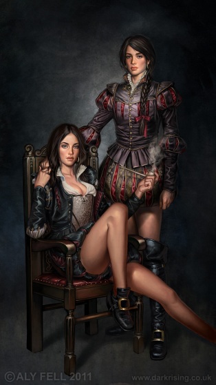
 

Rosalind and Celia - As You Like It by Aly Fell


SWR:  How would you describe your style and what, or who, are some of your influences?

It’s difficult when asked to describe your style. Sometimes it’s easier to compare it to others, as though it can then be compartmentalised, boxed. ‘Oh Aly Fell, he’s that pin-up artist!’ I don’t know if I have a ‘style’, but I do have a slight mission, and that, as I’ve said before, is to present women as people, not just a series of curves and aesthetics. It’s one of the reasons clothing is so important in my images, it presents part of their character and their world. Another thing which I try for is self-awareness: the women are not passive, or at least rarely so. So they look at you from the image, not in a ‘come hither’ way, but in a ‘knowing’ manner, as though you’re invited but on their terms, not yours. Humour can be a great way to cushion this. I don’t get the ‘half naked chick and snake monster’ thing. It’s fun when someone like Frazetta does it, but if you were a warrior woman, wouldn’t you smother yourself in protective clothing rather than a bikini bottom and a chain mail bra? And that’s what I mean about the ‘male gaze’: those illustrations are not for women, as a rule, but for men. And it’s not an argument that the men are half naked too, because it’s about power-play and the ‘male default’ in all things. But hey, I like looking at those images too! I grew up on Frazetta, but I find a more interesting subtlety in the work of Jeffrey Catherine Jones who often painted similar themes. Art is incredibly subtle in the way it communicates to us. There’s often a lot more going on in imagery than we think there is. Jeff Jones is an example of that.


Oscar Wilde by Aly Fell


Alongside Jones, my artistic influences and ‘likes’ are really varied: J W Waterhouse, Moebius, Arthur Rackham, Edmund Dulac, John R Neill (illustrator of the OZ books), Robert McGinnis, Miro, Mucha, Kay Neilsen, Don Lawrence, Austin Osman Spare, Aubrey Beardsley, Beresford Egan (all three masters of line)… I could go on and on! But I have a real fondness for illustrators that were working out of the UK during the golden age of illustration, Dulac, Rackham, Neilsen and lesser known examples like Florence Harrison, whom I tried specifically to emulate with an image of mine called ‘The Winter Queen’. Then there are the American illustrators like N C Wyeth, Dean Cornwell, Rockwell, Leyendecker etc.


The Winter Queen by Aly Fell


SWR:  You’ve worked on some well-known animated series, including Danger Mouse, during your time a Cosgrove Films.  What kind of impact did that experience in animated television have on the development of your style and/or your process?

Working in animation as an animator provides an almost unparalleled experience in the learning and understanding of movement and form. You have to work very quickly to capture the essence of an action or gesture, emotion or personality, in not just one drawing but a series of them.  As an illustrator, I tend to start an image exactly the same way I would start animating a scene, in that I try to get the essence down as immediately as possible with a simple and gestural scribble. Sometimes starting with ‘a circle for their head’ and then moving out from that. The white page is terrifying, and just getting some kind of mark down shatters that fear. It becomes a focus and a ‘seed.’
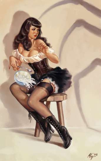
 

Betty Paige by Aly Fell


SWR:  What is your creative process?  For example, once you get the creative brief or the concept for a cover, what is your next step?  What is the process that takes you from the concept to the finished piece? 

I don’t think I’m unusual in my creative process when I get a brief. I work on a Cintiq, a digital drawing board that is just like a real one, but draws straight into the application on the PC. As a result I don’t have to scan and photograph line-work or roughs and can just get straight on with it. I start with the brief, and sketch out quickly some poses and any background that is required, usually very roughly trying to catch the bones of what I’m after. I’ll do a few options, and save them all off as small jpegs. These then go to the client and they can get an idea of composition, and then offer feedback and/or changes. The strongest covers are often the simplest, not least because they’re less arduous to paint, but because they have to sell the book and simplicity is less demanding when browsing book covers. Getting across the fundamentals of a story in as few elements as possible is sometimes harder as well. A cover is a big advert, or to some extent a condensed version of the book honed down. Complicated compositions can often end up being confusing.

The rough for the cover of ‘Discount Armageddon’ was a joy to do and the composition chosen was also my favourite.


Once the rough is OK’d, I look for reference and tighten up the sketch so that it’s more like the finished composition will be. In this case I used little reference for the pose and plenty for the face, but spent ages looking at photos of skyscrapers. The fun bit for me is always the character, not the environment, but it does have to support the image. With ‘Discount Armageddon’, the background was pretty simple, and that was just great to be allowed to concentrate on the character! I then block in colour and tone, sometimes working in greyscale first, and then start detailing the face. I almost always start with the face, and work out from there, building up more detail as I go. The finished piece sort of sneaks up on you! You’re working away, doing it bit by bit, then suddenly you realise anything more wouldn’t be adding to it, wouldn’t make it any better, and may have a converse effect. So usually at this point I send a version to the client, seeking a new set of eyes on it. There will nearly always be some sort of change; quite rightly so if there’s an element not appropriate or any drifting from the brief. So I make those changes and resend, crossing my fingers! Once again, it was an absolute pleasure to work with Seanan and Sheila, and they signed off pretty much with what I did.


The Death Dealer by Aly Fell


SWR:  If you could create a cover for any one book, what book would that be and why?

When I was younger, I loved the stories of H Rider Haggard, ‘King Solomon’s Mines’, ‘Montezuma’s Daughter’, ‘She’ etc. They’re a little dated now, compared with the writing of Haggard’s contemporary Conan Doyle, who still reads as fresh as ever, but I have a soft spot for Haggard’s strong female characters and a fantasy world that seemed much more real than Hyperborea or Middle Earth, because it was more than often the ‘still being discovered’ Africa (at least by generally rich white Victorian men). So I’d love to do a cover for ‘She’. And maybe ‘The Arabian Nights’… or ‘Alice’s Adventures in Wonderland’… But probably ‘She’ would be the one. It was a classic tale, turned into a none-to-bad Hammer movie in the 60’s, and at least 8 or 9 other versions, one of which being from 1899 makes it amongst the oldest stories ever filmed!


SWR:  Can you give us any hints about your upcoming cover work?

As for future covers, Seanan wants me to do the next in the ‘Discount Armageddon’ series. I’m also doing a series of young adult books for Simon and Schuster. I’ve recently had an adapted image used by Christopher Moore for his latest novel, ‘Sacre Bleu’, in a completely different style to my other work. I’ll be also producing a cover for a UK publisher, but that’s still under an NDA, so more of that later…
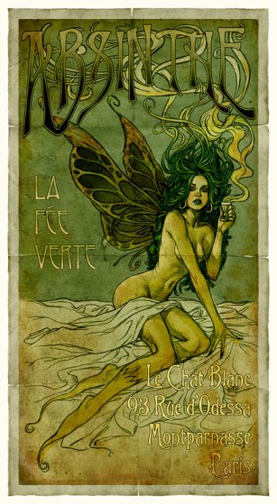
 

Absinthe Fairy by Aly Fell (This image was adapted for use on the cover of Christopher Moore's upcoming release, Sacre Bleu)


SWR:  Finally, do you have any personal projects you would like to share with us?

As for personal work in the future, I have an erratic web-comic called ‘Rosie Poe’ about the adventures of a slightly cynical Goth girl. Erratic, depending on what other work I have coming in. I started a picture book ages ago I’d like to finish called ‘Little Michelle, Who’s Going to Hell’, which is in a bit of an Edward Gorey mould. I also have a set of collectible cards coming out from Cult Stuff, and a tarot deck from Llewellyn! Steampunk inspired, which includes some of my existing Steampunk characters. But I would also like to rediscover oils as I attempted to last year. Digital is great, but I want to get messy again with art.


***


Please take a moment to visit Aly and check out more of his incredible work:

WEBSITE | BLOG | AMAZON

And you can visit Seanan McGuire to find out more about her InCryptid Series here:

WEBSITE | TWITTER

***

I’ve featured some of my favorite pieces of Aly’s in this interview.  Visit his website gallery and let me know which images are your favorites!

Happy Reading!

Shelf Candy – Interview with Artist Tony Mauro

24 Mar


Today I am happy to participate in the meme Shelf Candy Saturday, hosted by Five Alarm Books, in which the cover art of a book is highlighted and celebrated along with its artist.


The cover I am showcasing today is Delilah S. Dawson’s Wicked as They Come, cover designed by artist Tony Mauro.


WHY I LOVE THIS COVER:

Tony Mauro did a fantastic job with this cover.  I love it for two reasons – the mystery of it and its typographical treatment.  The featured character is Criminy Stain, a magical ringmaster of a traveling circus and a Bludman, a vampire-like being.  I love that Criminy is covered in shadow, that his face is somewhat obscured so that you have to look closely to make out his features.  This treatment suits his character perfectly because he himself is a bit of a mystery – at once gentle and attentive to Tish, the heroine of the story, while at the same time hinting at his capacity for violence.

I also adore the type treatment – mainly how the “W” in “Wicked” doubles as blood splattered fangs.  Lest you forget this is the tale of a Bludman, that “W” reminds you.


INTERVIEW WITH TONY MAURO:

I am excited to share with you an interview I did with Tony on his work for this featured cover.  Tony is a graduate of the Art Institute of Pittsburgh and, after moving to Los Angeles from Buffalo in 1994, has become a celebrated illustrator focusing on movie posters, book covers, and video game box art.  His past projects range from posters for The X-Files and Pirates of the Caribbean, to book covers for Chicagoland Vampires, Guild Hunters, and Sunshine (some of my favorite works).  He recently moved back to Buffalo in order to concentrate more on his fantasy art.

Without further ado, here is my interview with Tony.


SWR:  You have worked extensively on both movie posters and book cover art.  For films you usually have an actor or actress to base your piece on but for a book you really only have the text.  What is your process for taking that text and bringing the characters to life in your art?

My advantage here is that most authors go to great lengths to be as descriptive as possible when they introduce their characters so that certainly helps. My first step and always the best case scenario is to read the book before I do anything. Unfortunately, because of my workload, I don’t always have time to read the whole book but the first few chapters are usually the most descriptive because that’s when the author is introducing the characters and setting the tone and environment for the story. I’m also given a synopsis from the publisher at the beginning of the project which will detail the setting and character that they are interested in seeing portrayed on the cover.


SWR:  How much collaboration exists between the cover artist, the author, and the publisher in designing a book cover?

Most people would be surprised that there is no contact between the author and the cover artist at all. The publisher will often coordinate with the author and discuss the cover concepts before they contact me. All of my communication is with the in-house art director at the publishing house. In most cases they already have a good idea of what they are looking for before they contract me. A lot of these are series books so I’ve already established the style and look for the series on the past covers so our only task is to present a new scenario for our hero.


SWR:  Does most of your work happen on the computer or with traditional sketching and painting?

I was a traditional airbrush illustrator for the first 5-7 years of my career before crossing over to the computer. In the beginning I still did a lot of sketching and would even traditionally paint certain elements of the piece and then scan them in to finish up the details on the computer.  Nowadays I do everything from beginning to end on the computer and photography has become a huge part of what I do.


SWR:  Can you tell me specifically about how you created the cover for Wicked As They Come?  What was your process and inspiration?

My only direction on this one was to focus on the main character and to keep him mysterious. Obviously in this case the clothing and personal style of Criminy Stain play a huge role in defining the character. I was told to think “freak show ring master” which I thought was a great visual to play with. His tailcoat was described in a few passages from the book so I found a jacket online that fit the bill and got that ordered in time for the shoot. I’m building quite a collection of steampunk style clothing in my photo studio.  I experimented with a few different lighting set-ups that would cast some interesting shadows over him and once I picked the shot I liked I started working it up in the layout and experimenting with different settings to place him in that would define the genre as well as create some depth.


SWR:  I love the mysteriousness and danger hinted at on the cover of Wicked As They Come.  What is the one characteristic of Criminy Stain that you wanted to make sure translated from the page to your design?

His personal style was the thing that was most important to try and get across. When you’re dealing with one single image to present a character the only thing you can really play with to define who they are is how they’re dressed and whatever subtle expression they will have on their face. The determination and intensity in his eyes as well as the shadow falling across his face are what gave him the edge that he needed to give him that dangerous and mysterious quality.


SWR:  Since this is the first of a trilogy, was there an overall concept you created that would follow through to the other books in the series?

The biggest carry through for this series will be the style of the type treatment I used. We usually try and tackle each title in a series individually because even though we want them to look similar enough to be viewed as a series when they’re together, it’s very important that each book stand on its own.


SWR:  Who are artists that inspire your work?

There are several people that inspire me for different reasons. I’ve always been a huge Norman Rockwell fan, stylistically my work is completely different than his but I admire his ability to tell a story with one singular image.  Of the contemporary artists out there I really love Brom’s work and often look to his stuff for inspiration.


SWR:  If you could create a cover for any one book what book would that be and why?

I’m a huge James Patterson fan so I’ve always said I’d love to work on his Alex Cross series books. I’ve read all of them so I definitely have a connection to his characters as well as the tone of his books.


SWR:  You’ve created some of my favorite covers – Chicagoland Vampires, Sunshine, the last two Guild Hunter covers, and now, Wicked As They Come – can you give us any hints about your upcoming cover work?

I do have lots of things coming down the pipeline but I really shouldn’t discuss them until they are released. Confidentiality is very important in such a competitive marketplace. I’m working with several different competing publishers and loose lips sink ships 😉 I can tell you that I’ve done several survivalist books recently that will be hitting shelves soon. That category as well as the steampunk category are really blowing up.


Take a look at some of Tony’s cool fantasy work, some of which has not yet been posted on his site.


You can see more of Tony’s work at his website:  http://www.darkdayproductions.com/


Special thanks to Tony Mauro for joining me here on She-Wolf Reads!


Please stop by tomorrow for my Wicked As They Come review!

Cover Alert! “Devil’s Luck” by Carolyn Crane

19 Feb

I was excited to see Carolyn Crane, author of the amazing Disillusionist Trilogy, post a cover reveal for her new Simon novella.  I’ve been waiting for this to come out for a while and the cover art does not disappoint.

The novella is scheduled for publication in late February-early March but if you subscribe to Carolyn’s newsletter, you will be able to download it for free a week early.  Click the cover above and subscribe!

And in case you have not read the Disillusionist Trilogy, please do yourself a favor and read them.  This series has to be one of the most original I’ve read in a long time: