Archive | Interviews RSS feed for this section

Shelf Candy – Interview with MARC GASCOIGNE, Managing Editor & Art Director, ANGRY ROBOT BOOKS

21 Apr
Shelf Candy is a weekly meme hosted by the lovely Five Alarm Books.  This meme gives us an opportunity to highlight a cover we love and the artist who created it.  Please click the button above to find out how to participate and to see what other covers are being discussed this week.
***
This week I decided to do something different.  Rather than focus on one cover and one artist, I wanted to take a look again at the other half of the cover design team – the Art Director.  The AD is often responsible for the overall concept and for selecting and commissioning an artist to take that concept and turn it into a cover.  I approached Marc Gascoigne for an interview.  He is the founder and managing director of Angry Robot Books, a U.K. based publisher whose mission is to “publish the best in brand new genre fiction – SF, F, and WTF?!”  Yes, I love that mission, too.  Art Director is just one of the many hats Marc wears at Angry Robot and he was kind enough to take time out from a busy week of London Book Fair craziness to answer some questions on the origins of Angry Robot, his process, and his favorite curse word.
WHY I LOVE ANGRY ROBOT COVERS
They are unique and bold.  This is the primary reason I am drawn to the company’s covers across the board.  I tend to like the ones with a retro/vintage look but I also appreciate the strong graphical approach they take to design.  Edgy and young, the Angry Robot aesthetic is fast becoming one of my favorites in cover art.  Perhaps the one I’ve been gushing about the most this week is the cover for Chuck Wendig’s Blackbirds.  I know this is not an original choice (take a look at the Qwillery‘s Debut Author Challenge Cover Wars where this design is winning by a landslide – vote people!), but the cover is too beautiful not to mention.  A She-Wolf review of the book will be posted soon.
Please welcome Marc Gascoigne!
SWR:  Can you tell us how and when Angry Robot was established?

I set up AR under the aegis of HarperCollins in late 2008. A couple of the more forward-thinking folks there had seen the work I’d done at Black Library, supporting that book imprint by building a community of dedicated readers and fans, establishing a strong brand identity, and starting to embrace the changes in publishing that online and digital developments were promising.

Alas, self-same folks moved on from HC just as we launched, and as is so often the way, those who remained didn’t quite get what we were about. The end result was that nine months later we moved to Osprey Group. Although on the surface it was an unusual new home – military and historical non-fiction – once one considers the customers’ profile it becomes obvious. SF also has fanatical, enthusiastic, hobbyist readers, who are *into* the subject, who follow online and printed reviews, who have “Wants Lists” of titles they’re after. The amazing team at Osprey helped us get back on our feet within a few months, and we also launched in the USA at last. Since then we’ve just grown and grown, as indeed have the other parts of the group.


SWR:  You wear a few different hats at Angry Robot.  Can you tell us a bit about what you do in your role as Art Director for the company?

Quite simply, I commission the covers, usually to concepts that I have come up with. That involves a bunch of tasks: research the market, gather some concepts for the cover, research elements, track down a suitable and available artist, and supervise the process of to-and-fro as we work up the illustration and/or design. Sometimes I work up the typography – book titling, author name, and so on – too. On a few occasions, I’ve designed and illustrated the cover too, but not too often.


SWR:  What is the Angry Robot brand?

Erm, it’s a little robot with a red eye-slit. His name is Angstrom. You must have seen him.


Resistance is futile.


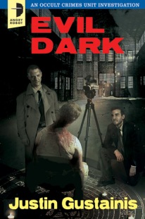
SWR:  One thing I love about many of the Angry Robot covers is the retro feel they have (Dead Harvest and Evil Dark).  There is an edginess to a lot of the designs.  Is there a certain look that is quintessential Angry Robot or that illustrates the Angry Robot brand?

No, but certain themes do recur, of course. And I’m not sure that “many” is quite right – really just two series, out of thirty or more. The Justin Gustainis books – police procedurals set in a town where vampires and werewolves are the norm – seemed to demand crime packaging to reinforce that side of the content, while the illustration had supernatural and occult elements. It was a short step from there to grab some old US pulps of the 50s and 60s and riff on their design.


The Chris F Holm titles took things a little further, and I must confess it is the only cover design I’ve commissioned that I deliberately didn’t show anyone, in case someone talked me out of it 🙂 It came from the recent online meme where designers recreated classic rock albums and Harry Potter books and movies in the style of old Penguin paperbacks. The Sam Thornton novels explicitly reference classic Dashiell Hammett and Raymond Chandler novels, and while looking at different designs of those I kept coming across the same Penguin designs. It was obvious to me that was the direction to go. Unbelievably, everyone agreed with me, and we’ve probably had more acclaim from fellow publishing types for those covers than any others.

As for the AR style, well, everyone very kindly focuses on the best covers rather than the ones that were more everyday, or didn’t quite work. But I have my favourite approaches, and certainly my favoured illustrators (as a quick glance at the five Joey HiFi covers across three authors will instantly reveal). To some extent, perhaps Joey’s covers stand out most, but overall I’d perhaps venture it’s just that we use more graphical approaches than most, and we’re not afraid to try something a little different.


SWR:  What is your creative process when designing a book cover?

It depends. Some, well, I have the idea gathering shape even as the book goes through the acquisition process (editor likes book, gathers potential sales estimates to convince sales team we should buy it, does so). Others come from suggestions by the author or the book’s editor. Questions are asked: who’s the readership, how old are they, what’s the genre of the book, what is working in that area, is our chosen illustrator available and what are their limitations, is the book a larger trade paperback or a smaller mass-market. And always – does the design work as a small on-screen thumbnail as well as a physical book?


SWR:  What makes a good book cover?

The purpose of a book cover is to sell a book, and the best do that – mostly by creating an accurate but also alluring impression of the thrills the book will offer. Then again, some are deliberately quirky, to get you to pick them up, and then hope that the design doesn’t let down or misrepresent the contents. The best and worst thing is that everyone has a different favourite cover (almost), from experimental graphics to florid romantic or fantasy paintings. But I always try to remember – if everyone’s wearing black, the guy in the white suit will always stand out.


SWR:  What have been some of your favorite Angry Robot covers and why?

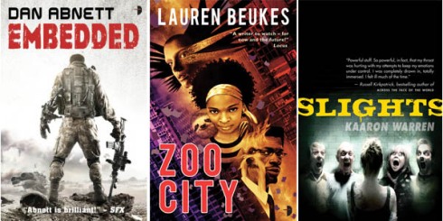
Embedded, because Larry Rostant nailed exactly what was in my head, that I’d seen when I read Dan’s novel. Zoo City by Joey HiFi, because it was something so immediately different yet recognisable. Slights, because even though I know some of the people on the cover and they’re all lovely, normal people, Stef Kopinski’s photo still scares the hell out of me. The World House, cos I designed it and people liked it. vN because Matt spent days and days building all those robot parts on the computer, only to dump Amy into them. The Great Game because David Frankland’s artwork is so simple yet so clever. Seven Wonders (which we’ll show the world next week) because my god, Will Staehle is a genius modern cover designer.


And for fun, Marc was game enough to take the Pivot quiz.  Here are his answers:


What is your favorite word?

Tsujigiri.

What is your least favorite word?

I don’t have one.

What turns you on creatively, spiritually or emotionally?

Thinkers, thinking, rethinking.

What turns you off?

An unexamined life.

What is your favorite curse word?

It changes from day to day.

What sound or noise do you love?

Cat purrs, depthcharge deep bass, my daughter’s gentle snoring, the sound of an enormous door slamming in the depths of hell.

What sound or noise do you hate?

The alarm clock.

What profession other than your own would you like to attempt?

‘Attempt”? Life isn’t a rehearsal, kid 🙂

What profession would you not like to do?

I know someone who runs a sock factory. He wears grey clothes. That.

If Heaven exists, what would you like to hear God say when you arrive at the Pearly Gates?

Unlikely on so many levels, but thanks for asking.


***

Please stop by and visit Marc at

TWITTER |  WEBSITE 

& of course visit Angry Robot and take a look at some of the covers/titles in the their current line-up

ANGRY ROBOT

Tell me which cover is your favorite!

Now, let’s get to reading…


Blog Tour – Interview with Camilla Chafer, Author of ILLICIT MAGIC & GIVEAWAY

20 Apr


I am excited to take part in the Bewitching Book Tour for Camilla Chafer, author of Illicit Magic, the first installment in the Stella Mayweather series.  Please click the button above to see all the blogs participating in this tour!  Camilla was kind enough to answer my questions on world-building, indie publishing, and what she is too chicken to read.  Stay around for the end of the interview where you will get a chance to win a copy of Illicit Magic.  And, now, please welcome Camilla!


SWR:  How would you describe Illicit Magic and the Stella Mayweather Paranormal Series in two to three sentences?

Illicit Magic is an urban fantasy series with a smart heroine who learns how to save herself. With my witches nothing is what it seems, so look out for double crossers, secrets, lies, and mysteries. My heroine isn’t kick ass; she’s got her own powers but she’s an everyday girl learning to live in an extraordinary world.


SWR:  What was your inspiration for the character of Stella?

I tried to imagine what it would be like to be able to perform magic but not understand what it was you were doing, and finding it very scary.  I wanted Stella to be the antithesis to many modern day heroines who need the powerful guy to swoop in and save her from the big bad. So, throughout the series Stella will learn how to wield her own power and save herself.


SWR:  World-building is so important to UF/PNR reads.  How did you start building the world and the magic of the Mayweather series?

I try to keep Stella’s world very grounded; so in many respects it is one that is familiar to us… but with an extra layer of magic. I introduce other supernatural beings – though the primary focus is on witches – and gradually build the layers of their existence. Stella is as new to the world as we are, so we find things out as she does. I keep a lot of notes to keep my world in order!


SWR:  You have the opportunity to adapt Illicit Magic into a film or TV series.  Who are your dream director, lead actress, and lead actor?

This is a tough one! I’ve never had a strong picture of anyone who could be Stella or Evan because they’re such unique characters. Étoilé, however, I imagined as a young Kristin Scott Thomas, kind of aristocratic, very elegant. I wish I knew more about directors; I guess the ideal one would be really willing to play about and have fun with the magic elements.


SWR:  How has your former life as a book editor impacted your process as a writer?  Do you find yourself being more critical of your writing?

It gave me more insight into the business side of publishing rather than writing fiction itself (I edited non-fiction and I’ve been a journalist for eight years). So, I had plenty of practice at blurb writing and had some insight into marketing. I could apply techniques I learned from writing non-fiction… things like not sweating the small stuff, getting something down on paper, and being able to write fast and consistently. It’s hard to be hyper critical of your own writing but when something isn’t working, I rip it out or rewrite until I’m happy. I also go through several edits before my editor even sees a copy. Hmm, maybe I’m more critical than I thought!


SWR:  Who are authors you admire and who have influenced your work?

I adore Sarah Addison Allen’s work and how she brings magic into everyday things. Robin McKinley writes wonderful fantasy. HP Mallory’s Dulcie series and JR Rain’s Samantha Moon books are lots of fun.


SWR:  What do you read in your free time?

I love mysteries, UF/PNR, magical realism and I’ll pick up a thriller or a romance if it interests me. The only genre I don’t read is horror. I’m too chicken.


SWR:  What advice would you give to aspiring writers who are interested in taking the indie publishing path?

Really educate yourself about the industry and practice, practice, practice. Assuming you’re there with your writing, start researching cover designers, editors and proofreaders to get the right team behind you; learn how to format, how to upload and how to market. Have fun with your writing but think like a business. Learn how to get people interested in your books by finding out what other writers did and how you can emulate their success. Don’t rush. Take your time, get it right.


SWR:  Tell us about some of your upcoming projects.

My next project is a new mystery series. It’s a lighthearted romp about an office temp who stumbles across her boss’ dead body and falls headfirst into the investigation of major insurance fraud. It was so much fun to write. All three books will be out May – July. Right now, I’m working on the fourth book in the Stella series which is due out soon and I hope to complete the series this year.


SWR:  Thanks so much for coming by the blog!

Thanks for having me!

***

ILLICIT MAGIC GIVEAWAY!

Illicit Magic by Camilla Chafer

 OFFICIAL BLURB:

More than three hundred years after the most terrifying witch hunts the world    has ever known, it’s happening again.

Racing from attack by the ruthless Brotherhood in London to the powerful witch council in New York, twenty-four-year-old novice witch Stella has to put her faith in strangers just to stay alive but she might not be any safer in their midst than from the danger she is running from.

Sent to an extraordinary safe house by the sea to learn her craft, Stella finds there is more than one dark secret in her new family: Étoile’s sister is spoken of in fear and sadness; Marc is supposed to be a powerful witch but is missing his magic; where does the owner of their safe house vanish to every day and why does Evan have the eyes of someone not quite human?

There is only one secret that someone will do anything to keep quiet, but whose secret is it and will Stella have to pay the price for silence?


Amazon UK Top 10 contemporary fantasy bestseller

Amazon US Top 45 fantasy bestseller

Amazon US Top 50 contemporary fantasy bestseller


Please take a moment to say hello to Camilla!

WEBSITE | TWITTER| FACEBOOK


HOW TO ENTER:

Please leave a comment below telling me what your favorite Urban Fantasy or Paranormal “world” is and you will be entered to win a copy of Illicit Magic!  A winner will be chosen at random.  Please remember to leave your email address so I can contact you.  Winner will be announced April 27, 2012.


Let’s get to reading!

Shelf Candy – The Jane True Series – Lauren Panepinto and Sharon Tancredi

7 Apr

Shelf Candy is a weekly meme hosted by the lovely Five Alarm Books.  This meme gives us an opportunity to highlight a cover we love and the artists who created it.  Please click the button above to find out how to participate and to see what other covers are being discussed this week.

***

This week I decided not to highlight one cover but instead I wanted to showcase the covers of an entire series.  And that is Nicole Peeler’s Jane True series.

WHY I LOVE THESE COVERS:

What isn’t there to love about these?  As a big fan of the Urban Fantasy genre, I can say without hesitation that these are some of the most unique covers out there.  I remember when the first book was released I saw it  in a bookstore and my eye was immediately drawn to it.  It was different.  Unique.  I picked it up, read the back, and was convinced that this was going to be special.  And it was.  I loved the book.  The style is girly and fun but with an edge that makes it exciting.

I am happy to introduce you to the team responsible for creating these covers, Lauren Panepinto, Art Director at Orbit Books, and Sharon Tancredi, Artist and Illustrator.

SWR:  Sharon, can you tell me briefly what your path was to becoming an artist/illustrator?

SHARON:  I started my career a bit later in life than most!  I had worked in advertising for many years, on the commissioning side of things, as an art buyer.  I was commissioning both illustration and photography for our clients, which led to a real passion for illustration, and also prepared me well for the business side of working as an illustrator.  About ten years ago I decided to do a post-graduate degree in illustration, and in 2003 I started my new career.


SWR:  How did you become involved with the Jane True series?

SHARON:  I was contacted by Lauren Panepinto, the fabulous art director at Orbit Books, who was interested in doing something a bit different for a UF series by then new author Nicole Peeler.  I was very excited by the brief and we went from there!


SWR:  Lauren, the covers for the Jane True series are truly unique – they are definitely not the typical style for a UF read.  What was the decision-making process for such a bold choice?

LAUREN: At Orbit, when we were reading Nicole Peeler’s first manuscript, we loved how unique her voice was. We really felt it needed something different from the standard sexy-girl urban fantasy covers. As with the original Charlaine Harris covers, there was a whimsy to Nicole’s setting and characters that we wanted to highlight with a unique look. I thought Sharon Tancredi’s illustration style struck the perfect note of cute but still sexy, whimsical, but still a bit goth and dark and supernatural.


SWR:  How much collaboration do you have with the author, Nicole Peeler, on the cover art?

SHARON:  Normally an illustrator has no contact with the author of a book for whom they are creating a cover, and generally an author has very little input in the process.  It’s all down to the publisher’s art department, who have a vast experience in commissioning cover art.  Normally as an illustrator you don’t even read the book, but are given a synopsis of the story, and are more or less told what to draw.  The initial vision usually comes from the art director, and you are bringing their idea to life.  Sometimes you might get a chapter or two to read, or a very early draft of the book.  By this stage the book is usually still being written and edited and is seldom in its final form, and the book is literally being put into its final form as you create the cover, with everyone working to a deadline.  Sometimes the brief is a bit more flexible, and you are asked to provide a few ideas in rough form, based on reading whatever material is made available to you.  The art director then decides which idea to go with, and you produce the final art.  Nicole was the first author that I’ve ever had contact with, as once I had read the draft I was really blown away by the story and her writing, and emailed her to tell her how excited I was to be doing her first cover!  I had never read a UF book before, and although prior to this it might not have been the sort of fiction that I would have chosen to read, her amazing story really got me hooked on the genre.  We became friends after that and often spoke about ideas for all the covers, which really helped me flesh out Jane’s character and other details that were key to each book.  It was brilliant working with both Lauren and Nicole, as we all seemed to have a similar vision of Jane and it really was a team effort!


SWR:  The last Jane True book (and the soon to be released book) had a slight change in the design – a header and footer for the book’s title and author.  What was the reasoning for this change?

LAUREN: It was a change mostly made for legibility at a smaller size. The banner design is great, but really has a hard time being legible at thumbnail size, either for ebooks or ordering print books online. We wanted to keep the illustrations, but needed the title and author to pop more.


SWR:  What is it about Jane True and her world that you feel is the most important thing to convey in the cover art?

LAUREN: Jane’s unique voice. She’s not the standard all-badass-all-the-time urban fantasy heroine. She’s a complicated and completely relatable heroine, and the covers had to be unique to signal that. It’s always a risk doing something different from the herd, but we try to be risk takers with Orbit covers, and the fan response to the covers has been really amazing. Once you’ve met Jane, you feel so strongly that these are great illustrations for the books.


SWR:  Has there been any thought given to producing a Jane True graphic novel based on the style you’ve created?

LAUREN: I need to take the fifth on this one, but the fabulous thing about Orbit and Yen Press is when imprints are physically sitting on top of each other, there’s a lot of collaboration, like the new Soulless manga series.


SWR:  Sharon, can you tell me a little bit about your process.  Once you get an assignment, how do you go about creating a cover?

SHARON:  Quite often when I read a brief and/or manuscript I instantly get a clear idea of what I want to do, especially in the case of an imaginative and well-written story with a strong central character.  Jane True took form straight away – I saw her as both a cute and sexy little brunette, with a real edge to her looks and personality.  She wasn’t just some typical urban fantasy warrior pin-up, but someone a bit more complex.  Both vulnerable and strong, girlishly cute but also powerful and sexually uninhibited and confident.  Both clumsy/self deprecating but also razor sharp clever and witty.  Ambiguous characters like Jane are always the most fascinating and inspiring ones to try and visually manifest!  I started sketching, looking for visual references of women that I felt captured aspects of Jane, especially her half coquettish ingénue/half kick ass urban fantasy warrior persona.  I know that some people had a few issues with her apparent “adolescent” appearance on the first cover – her sexy but child-like looks didn’t sit right with some, but I really wanted to get the exciting ambiguity of this amazing young lady across!  After several rough drawings and some post-final artwork tweaking Jane’s image was born!  There was much to-ing and fro-ing with the first cover, as there always is, getting not only the look of the character right but also the atmosphere of the environment and the general design and layout, but once we finished the first cover the template was set and the sequels followed on from there.  The covers, as you say, were certainly something of a departure from the typical style for a UF read, but I think Jane is not a typical UF heroine and that is precisely what we all wanted to convey with the covers.  The stories are different, Jane is different, and thus so are the covers!  And it was great working with an author and art director who both wanted to have a go at breaking the mold!  I also think it was a great idea to go with illustration as opposed to photography, as it gives Jane the “other-worldliness” that I think would have been difficult to achieve otherwise.


SWR:  What is the difference between a cover designer and a cover illustrator?

SHARON:  A cover designer is really an art director.  The designer or art director has the vision and then commissions the illustrator to create the image.  There is always a bit of collaboration, in that, depending on the project, as an illustrator you are able to make suggestions and have some input in the process.  Each job is different and some are far more prescribed than others.


SWR:  Who are artists that inspire your work?

SHARON:  My inspirations are vast and varied and probably clear to many…  I’ve always been inspired by lowbrow/pop surrealism artists like Mark Ryden, Tara McPherson, Ana Bagayan, Femke Hiemstra and many others.  I love the wide-eyed innocence of their pretty girls and animals, with that darker undercurrent bubbling away underneath the surface.  I also take inspiration from Japanese Manga art, 1950’s packaging design and all things kitsch/retro, and I love the decoration and embellishment you find in Victorian engravings and old illuminated manuscripts.


SWR:  If you had the opportunity to create the cover for any book, what would that book be and why?

SHARON:  That’s a tough question, far too many to mention!  A dream job would be to illustrate a series of Grimm fairytales, as they there is so much opportunity for beautiful images with dark and complex themes…  The best cover to illustrate though would be the cover for my own self-written, self-illustrated book, which I’m always trying to find the time to do in between commissions!  Watch this space!

LAUREN:  Well every designer lusts after a solid backlist. Something that has a little less stress because it’s a rerelease, and you can repackage with a little more freedom to do something as a set and conceptual. I love working at Orbit, they acquire great authors, but we’re only 5 years old in the US, so not much re-releasing to play with (yet). I am ever-jealous of the fabulous projects Coralie Bickford Smith gets to do with Penguin backlist titles, I’d love to do that for fantasy and scifi sets:


SWR:  Finally, any hints you can give about upcoming cover art?

SHARON:  Can’t give too much away as we’re still working on that!  Suffice to say that the cover for the final book in the series will receive the dramatic finale that it deserves!

***

Special thanks to both Lauren and Sharon for visiting the blog and to Nicole Peeler for a wonderful series.  Please take a moment to say hello to them!

LAUREN PANEPINTO

Facebook | Pinterest | Twitter

&

SHARON TANCREDI

http://sharontancredi.com/

&

NICOLE PEELER

Website | Twitter | Amazon

Now, tell me what you think about the Jane True covers!

Happy Reading!

Shelf Candy – Interview with Devil’s Luck Artist Anne Cain

31 Mar


Today is Shelf Candy day!  This is a meme hosted by the lovely Five Alarm Books in which the cover art of a book is highlighted and celebrated along with its artist.  This is my second edition of the weekly meme, and it is quickly becoming one of my favorite things to do.

The cover I am showcasing today is Devil’s Luck, written by Carolyn Crane, artwork by Anne Cain.


WHY I LOVE THIS COVER:


The moment I saw this cover I loved it.  As a big fan of The Disillusionist Trilogy, I was excited to see a novella about the enigmatic and reckless Simon.  What I appreciated about the artwork was its subtle romanticism coupled with a sense of vulnerability that you would not expect from the character.  The textured background, brooding hero, and beautiful colors combined to create a cover I thought was pretty powerful.

The person responsible for its creation is the artist Anne Cain.  Based in the Southwest, Anne is a celebrated artist with extensive experience in publishing and illustration.

Let me introduce you to the wonderful Anne Cain!


SWR:  Can you tell me a little bit about your art background – your training and development as an artist and how you got into doing book covers specifically?

I’ve been drawing my whole life, and being an artist was one of my earliest dreams as a kid (right after being a paleontologist and crime fighter). I’m trained in studio art and have a BFA in drawing, but I fully embrace graphic and digital arts as well. A friend introduced me to the world of epublishing a few years ago, and I got into doing covers in addition to other illustration projects.


SWR:  What techniques do you use to create your covers? Traditional painting and sketching or is it more computer based?

My approach to cover art varies as much as the genres of the books I work on. I try to be a jack-of-all-trades and can switch styles/techniques depending on the project. So, for example, a YA fantasy with steampunk elements might call for an illustrated cover, while a dark paranormal romance novel needs a mixed media image with photos and digital paint. That kind of versatility is fun for me as an artist since I have more options to play with while creating the image.


SWR:  Tell me the story of how you got involved with Carolyn Crane’s “Devil’s Luck”?  Had you read the series before and what was it like working with her?

I had a little luck of my own in creating the cover for “Devil’s Luck”. Carolyn herself approached me with info on her story and characters, and I was hooked.  She was amazing to work with, not only because she’s a great person, but because she let me have fun with the art. Creative freedom is something any artist appreciates!


SWR:  The character of Simon is a bit of a mystery and tends towards the flamboyant in his sense of style.  What I love about your cover is that feeling of Simon being laid bare (both literally and figuratively) and he retains that sense of mystery while hinting at something deeper than what one might expect from the character.  I think that fits the story perfectly.  I also like its subtlety – he is depicted as a romantic figure but it doesn’t have a typical romance feel.  How did you develop the concept for the cover and how much collaboration with Carolyn was involved with its design? (and I promise my next question won’t have a paragraph lead in)

LOL! Well, it’s a fantastic question. I know there’s a lot of imagery out there that romance novels rely on to help promote the content of the book. The bare-chested hunk and, to use an older example, the “clinch” pose, are common visual conventions that let readers know at first glance, “This book is sexy, romantic, and you want to read it now!” The trick as a cover artist is to acknowledge those conventions while making sure the uniqueness of that particular story is demonstrated. With “Devil’s Luck” the emphasis had to be on Simon because he’s such a fabulous character and we wanted to capture his essence—especially with his tattoos!—but we also had to be careful to not overpower the ‘romance element’. Carolyn and I discussed whether or not to portray him with more of a nod to his flashy sense of fashion, but we decided that less is more, and that resulted in the cover where we get a sense of Simon “being laid bare”.


SWR:  What is the one thing about Simon that you felt must be translated on the cover?

Strength, physically of course, but also that intensity of spirit and recklessness.


SWR:  If you are familiar with the series, what other characters from the Disillusionist world would you like to bring to life on a cover?

I’ve read Double Cross, and I love Justine. If Carolyn were to pen another story with her, I’m claiming dibs on the chance to make some art! *lol*


SWR:  Looking at your body of cover work, I would say that subtle yet edgy and romantic are words that come to my mind when trying to describe it.  The layered backgrounds are also interesting and seem to be a signature of your style.  How would you describe your style?

I love texture and color and intensity. I like creating images which hopefully make the viewer pause for a moment or two just to enjoy looking. Rich backgrounds with just a hint of abstraction enhance that viewing experience. So I would definitely describe my style as “atmospheric”.


SWR:  What artists have influenced your work?

So many! Drew Struzan, James Jean, Paul Cadmus, Cliff Nielsen, Brom, Julie Bell…those are just a few that popped into my head on the spot. Never underestimate where and from whom an artist will draw inspiration—if art is a language, we pick up turns of phrases and colloquialisms from everywhere.


SWR:  How has the rise of the eBook format impacted the art of book cover design?

Definitely more consideration is given to how the artwork will reproduce in teeny-weeny thumbnail sizes. We also have to be mindful of how the art might look on black and white screens, in the case of some Kindles. Fundamentally, though, the spirit of the design stays the same: make a piece of art that’s eye-catching and awesome!


SWR:  If you could create a cover for any one book, what would it be and why?

I’m going to throw something out there which might be totally from left field, but it would be the bee’s knees to create the cover to a new edition of The Dark Phoenix Saga. I loooove comics, and that graphic novel is one of my all-time fave X-men books.


SWR:  Are there any up-coming projects you would like to tell us about?

On the cover art front, I’m excited to be working with a number of excellent companies. I recently added Amazon Publishing to my client list, and I’m getting ready to work with C.E. Murphy on some art projects which is going to be fun. I might also have a short sketchbook coming out from Dreamspinner Press later this year. For updates on projects and convention appearances, please check out my DeviantArt page or hit me up on Twitter!


 http://annecain.deviantart.com/

http://twitter.com/annecain

Please take a look at some of Anne’s other beautiful work:

A big thank you to Anne for her interview!  Please take a moment to check out her site and follow up with her on Twitter.  And read the book!  The Disillusionists Trilogy is one of the most original UF series out there and the artwork on Devil’s Luck highlights that!

Happy Reading!

Meet Delilah S. Dawson, Author of Wicked As They Come

26 Mar

Today, I am excited to share with you an interview I did with Dalilah S. Dawson, the author of the magical new novel, Wicked As They Come.  If you’ve read my review then you know I truly enjoyed this book (review).  It is original, sexy and sweetly romantic.  And a fantastic introduction to the new world of Sang and the Blud novels.

Delilah has a B.A. in Studio Art from the University of Georgia and before writing she was an art instructor and arts administrator.  She is also the associate editor for Cool Mom Picks.  Delilah describes herself as “an artist, wife, mom, goof, geek, and cupcake enthusiast.”  I would also add “great writer.”

Please enjoy the interview!

SWR:  Congratulations on the publication of your first book!  Can you describe the moment you found out the book was being published?


I was in the carpool lane, waiting to pick up my kids from preschool. My cell rang—my agent’s number. I went on spazz alert and almost screamed SQUEE into the phone, because my agent had never called me unannounced before. Turned it out it was an offer, and not just for one book—for a three-book series. I found out about the other two publishing houses’ interest via email, but that first phone call was amazing. The auction occurred while we were in Athens, GA for a show by The Civil Wars, and the whole week was magical.

SWR:  I love the cover of Wicked As They Come.  What is the process between an author and an artist/illustrator in creating the cover?  And as an artist yourself, did you have a difficult time handing over the reins to someone else?

For this first book, it was actually a huge surprise. I hadn’t heard from my editor in months, and then it just dropped into my inbox. At first, I was shocked, because it wasn’t at all what I had expected—but then it grew on me. There were a few changes that needed to be made, but my editor and the artist were extremely accommodating. For example, the original version had Criminy in leather jeans with a zipper, which took away from the steampunk/Victorian look. I love the new stance and more period-correct pants, and I really love the touches of red. Tony Mauro is a super nice guy and an amazingly talented artist, and I hope he does all my covers!

SWR:  World-building is key in Fantasy/PNR books.  What was the inspiration behind the world of Tish and Criminy Stain?

Two things came together for the inspiration of Sang: Buffy the Vampire Slayer and the album Like Vines by The Hush Sound. You can hear a little of Spike in Criminy, and lots of scenes and lines come from that album. I know it sounds cliché, but I dreamed the scene where Tish wakes up in Sang and sees Criminy for the first time and thinks of him as “an extra naughty version of Mr. Darcy.” And then the rest of the world just happened through logic and imagination.

SWR:  Can you tell me a little bit about the inspiration for the characters themselves?  And how did you come up with the name “Criminy Stain”?

Criminy arrived in my head fully formed. What he looked like, his name, how he talked, his mannerisms. I don’t know if my subconscious just wanted to communicate its ideal man or what, but he just happened, and I never questioned it. My editor once remarked that his name was odd, and I admitted that she could change it if she wanted, but… I guess he got his way in the end. Tish took more work. She began as a wife with a baby, then became just a wife, then we got rid of her husband and made her a damaged but resilient heroine with a special relationship with her dying grandmother. I like her best this way—she has a good mix of kindness and spitfire.

SWR:  If you could cast any actors to play Tish and Criminy who would you cast?

The question is so difficult! If I had control over space and time—or a Tardis—I would grab Ashley Judd or Sandra Bullock from about 1996 and Jonathan Rhys Meyers from 2004. As for right now, I can’t think of an actress who can be charming but tough, Southern but not saccharine, curvy and not outrageously, instantly gorgeous. And as for Criminy, the actor would have a lot to live up to, is all I’m saying.

SWR:  I love that you are developing fragrances inspired by the characters.  Nothing transports you to a place and time like a scent.  How did you come up with this idea?   When and where will they be available?

I’ve been a huge fan of artisan perfumes for over a decade now. Black Phoenix Alchemy Lab led me to Villainess Soaps, and Brooke and I have been internet pals for years. Scent plays a big part in my writing, especially Criminy’s scent, which plays an important role in the plot. He’s described as smelling like berries and red wine and crushed green things, and I think Brooke captured that amazingly well. I wear Criminy almost every day and will be the first in line to buy a huge bottle! It was one of my dreams, to smell my characters, and I’m just so lucky that she liked the book and was game. The quality and uniqueness of her soaps and perfume oils is astounding, and her packaging is right up my alley.

SWR:  Is there a specific book or author that has inspired you the most?

I was raised to think that romance books were silly, but then a good friend of mine suggested Outlander by Diana Gabaldon, back in 2001 or so. I picked it up at a used book store when I had the flu and stayed up all night to read it. It taught me that romance isn’t just bodice ripping—that the story can be well crafted and beautifully written. That the characters can be fully-formed and have the capacity to grow as people. That the history can be fascinating and well-researched. And that you don’t have to use a single euphemism for anyone’s junk, something that always takes me out of the story. More recently, Gail Carriger and Deanna Raybourne have been a great inspiration for how to write exactly what you want to write, defy genre, and treat your readers with love and respect.

SWR:  What do you read in your spare time?

Mostly YA and paranormal romance. I have two children under five, so what I need most is an escape. I don’t want to read anything that makes me cry. Although I read Maggie Stiefvater’s The Scorpio Races recently and was blown away by the power of the story and the lyricism of the writing. That one and The Night Circus are not my usual sort of vampire/werewolf/dystopia fodder, but they both drew me into an entirely new world where I wanted to stay.

SWR:  As a blogger, I am always amazed at the power of the internet and social media.  How do you think they’ve impacted writing and publishing?

Honestly, I don’t know if I’d even be published without the internet. I learned everything I know about querying and agents and editors online. I love the challenge of brevity and humor on Twitter. And I like that if you follow people you like, you find out about new things that they like that you like, too, from book recommendations to bands to interesting news stories that can spark story ideas. And the support is great, too, both for failures and triumphs. The three idol authors I’ve listed—Diana Gabaldon, Deanna Raybourne, and Gail Carriger—have all tweeted me before, and I was so excited!

SWR:  Finally, if you could take any character from a favorite book or series and drop him/her into the world of Tish and Criminy, who would it be and why?

I think Gail Carriger’s Ivy Tunstall would have a fantastic time in the Sangish version of London. The humans have to keep almost all their skin covered, and huge, weird hats are all the rage. Maybe she could be a costumer with Criminy’s Clockwork Caravan, too, since she likes adventure and doesn’t mind odd people.

Thanks so much for having me! I hope y’all enjoy the book! ~Delilah


Visit Delilah at www.delilahwrites.blogspot.com or on Twitter @DelilahSDawson

Wicked As They Come can be purchased at

Amazon | B&N | Book Depository


Take a listen to the band that helped inspire the creation of the world of Sang, The Hush Sound:


I hope you enjoyed this interview.  Happy Reading!

Shelf Candy – Interview with Artist Tony Mauro

24 Mar


Today I am happy to participate in the meme Shelf Candy Saturday, hosted by Five Alarm Books, in which the cover art of a book is highlighted and celebrated along with its artist.


The cover I am showcasing today is Delilah S. Dawson’s Wicked as They Come, cover designed by artist Tony Mauro.


WHY I LOVE THIS COVER:

Tony Mauro did a fantastic job with this cover.  I love it for two reasons – the mystery of it and its typographical treatment.  The featured character is Criminy Stain, a magical ringmaster of a traveling circus and a Bludman, a vampire-like being.  I love that Criminy is covered in shadow, that his face is somewhat obscured so that you have to look closely to make out his features.  This treatment suits his character perfectly because he himself is a bit of a mystery – at once gentle and attentive to Tish, the heroine of the story, while at the same time hinting at his capacity for violence.

I also adore the type treatment – mainly how the “W” in “Wicked” doubles as blood splattered fangs.  Lest you forget this is the tale of a Bludman, that “W” reminds you.


INTERVIEW WITH TONY MAURO:

I am excited to share with you an interview I did with Tony on his work for this featured cover.  Tony is a graduate of the Art Institute of Pittsburgh and, after moving to Los Angeles from Buffalo in 1994, has become a celebrated illustrator focusing on movie posters, book covers, and video game box art.  His past projects range from posters for The X-Files and Pirates of the Caribbean, to book covers for Chicagoland Vampires, Guild Hunters, and Sunshine (some of my favorite works).  He recently moved back to Buffalo in order to concentrate more on his fantasy art.

Without further ado, here is my interview with Tony.


SWR:  You have worked extensively on both movie posters and book cover art.  For films you usually have an actor or actress to base your piece on but for a book you really only have the text.  What is your process for taking that text and bringing the characters to life in your art?

My advantage here is that most authors go to great lengths to be as descriptive as possible when they introduce their characters so that certainly helps. My first step and always the best case scenario is to read the book before I do anything. Unfortunately, because of my workload, I don’t always have time to read the whole book but the first few chapters are usually the most descriptive because that’s when the author is introducing the characters and setting the tone and environment for the story. I’m also given a synopsis from the publisher at the beginning of the project which will detail the setting and character that they are interested in seeing portrayed on the cover.


SWR:  How much collaboration exists between the cover artist, the author, and the publisher in designing a book cover?

Most people would be surprised that there is no contact between the author and the cover artist at all. The publisher will often coordinate with the author and discuss the cover concepts before they contact me. All of my communication is with the in-house art director at the publishing house. In most cases they already have a good idea of what they are looking for before they contract me. A lot of these are series books so I’ve already established the style and look for the series on the past covers so our only task is to present a new scenario for our hero.


SWR:  Does most of your work happen on the computer or with traditional sketching and painting?

I was a traditional airbrush illustrator for the first 5-7 years of my career before crossing over to the computer. In the beginning I still did a lot of sketching and would even traditionally paint certain elements of the piece and then scan them in to finish up the details on the computer.  Nowadays I do everything from beginning to end on the computer and photography has become a huge part of what I do.


SWR:  Can you tell me specifically about how you created the cover for Wicked As They Come?  What was your process and inspiration?

My only direction on this one was to focus on the main character and to keep him mysterious. Obviously in this case the clothing and personal style of Criminy Stain play a huge role in defining the character. I was told to think “freak show ring master” which I thought was a great visual to play with. His tailcoat was described in a few passages from the book so I found a jacket online that fit the bill and got that ordered in time for the shoot. I’m building quite a collection of steampunk style clothing in my photo studio.  I experimented with a few different lighting set-ups that would cast some interesting shadows over him and once I picked the shot I liked I started working it up in the layout and experimenting with different settings to place him in that would define the genre as well as create some depth.


SWR:  I love the mysteriousness and danger hinted at on the cover of Wicked As They Come.  What is the one characteristic of Criminy Stain that you wanted to make sure translated from the page to your design?

His personal style was the thing that was most important to try and get across. When you’re dealing with one single image to present a character the only thing you can really play with to define who they are is how they’re dressed and whatever subtle expression they will have on their face. The determination and intensity in his eyes as well as the shadow falling across his face are what gave him the edge that he needed to give him that dangerous and mysterious quality.


SWR:  Since this is the first of a trilogy, was there an overall concept you created that would follow through to the other books in the series?

The biggest carry through for this series will be the style of the type treatment I used. We usually try and tackle each title in a series individually because even though we want them to look similar enough to be viewed as a series when they’re together, it’s very important that each book stand on its own.


SWR:  Who are artists that inspire your work?

There are several people that inspire me for different reasons. I’ve always been a huge Norman Rockwell fan, stylistically my work is completely different than his but I admire his ability to tell a story with one singular image.  Of the contemporary artists out there I really love Brom’s work and often look to his stuff for inspiration.


SWR:  If you could create a cover for any one book what book would that be and why?

I’m a huge James Patterson fan so I’ve always said I’d love to work on his Alex Cross series books. I’ve read all of them so I definitely have a connection to his characters as well as the tone of his books.


SWR:  You’ve created some of my favorite covers – Chicagoland Vampires, Sunshine, the last two Guild Hunter covers, and now, Wicked As They Come – can you give us any hints about your upcoming cover work?

I do have lots of things coming down the pipeline but I really shouldn’t discuss them until they are released. Confidentiality is very important in such a competitive marketplace. I’m working with several different competing publishers and loose lips sink ships 😉 I can tell you that I’ve done several survivalist books recently that will be hitting shelves soon. That category as well as the steampunk category are really blowing up.


Take a look at some of Tony’s cool fantasy work, some of which has not yet been posted on his site.


You can see more of Tony’s work at his website:  http://www.darkdayproductions.com/


Special thanks to Tony Mauro for joining me here on She-Wolf Reads!


Please stop by tomorrow for my Wicked As They Come review!